With all else being equal, the more effectively a restaurant design utilizes color to establish an image, create ambiance and arouse customer’s appetites, the greater the chances are for long-term success.
If you operate any type of food service establishment, then you are probably aware of how much color affects that overall message your restaurant delivers to your customers.
Just like when designing your menu, it’s important to remember that color and design may affect customer behavior — and that takes precedence over your favorite color.
Some theories may seem outdated, but there’s still something to be said about certain colors resulting to increase of customers’ appetite than others. Always ask yourself; how long would you like your customers to stay and how often would you like them to visit your restaurant? Well guess what, colors are your secret!
Whether your goal is to achieve fast flow-through rates, or you’re trying to provide a relaxed dining experience for your guests, it’s extremely important to choose a restaurant color palette that adheres to your business’s brand and helps it achieve its goals.
Below, we summarize the image different shades of color portray a restaurant;
Light colors
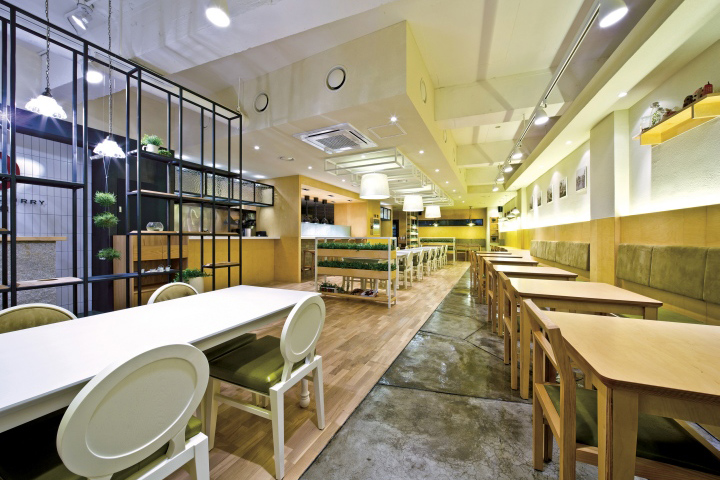
These include; white, beige, ivory, pale yellow etc. They not only give an illusion of wider spaces, they also evoke a relaxed feeling, encouraging customers to stay longer making them suitable for more upscale establishments.
These colors are however not suitable for fast-food restaurants and take-out businesses.
Dark colors
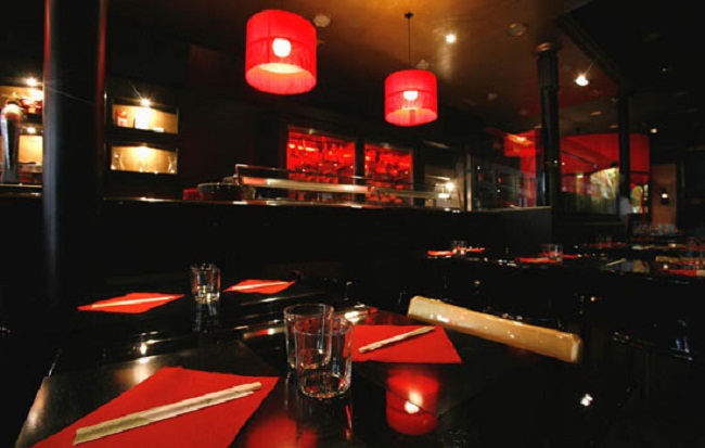
These include; royal purple, deep blue, dark grey and crimson. These, unlike bright colors, give an illusion of smaller spaces. They create a more intimate setting, reducing the impersonal feeling of large group dining, making them ideal for banquet halls.
It is however not wise to overuse these dark colors as they may create a depressing mood.
Cool colors
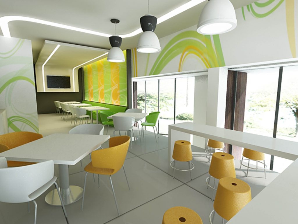
These include; blue, green, lighter shade of purple, burgundy and metallic. These colors give a fresh, energetic and inspiring mood. These colors may be great for people who are high spirited and jolly.
However, if you are not looking to sell ice cream or other cold drinks exclusively, you will need to reconsider before using these colors.
Bright colors
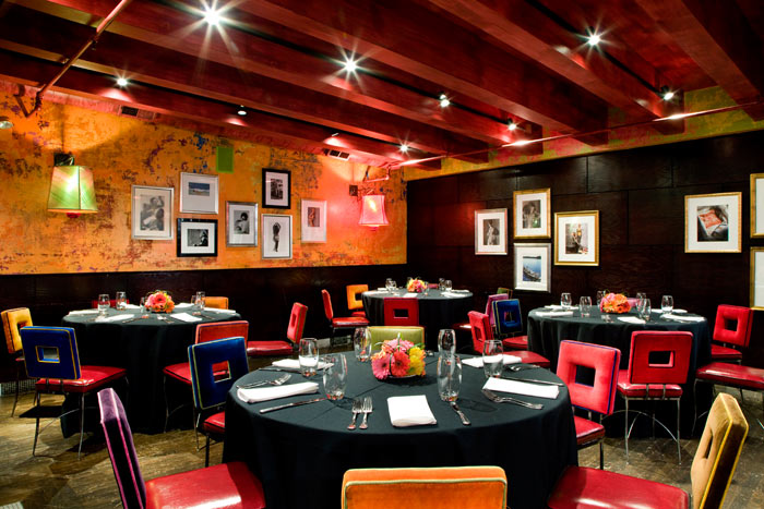
These include bright shades of red, yellow, green and orange. These colors, believe it or not, tend to raise the heart rate and blood pressure, which may excite customers, making them eat faster.
These colors are suitable for restaurants that want high turn-over such as fast-food restaurants. They are however not suited for fine dining establishments.
Warm colors
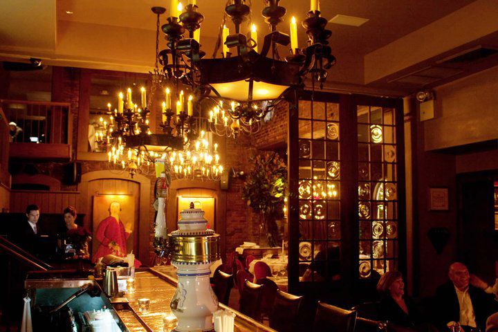
These include warmer shades of red, yellow, orange and terracotta. When combined with dim/soft lighting, they give a feel of calmness and relaxation. Since they encourage the customers to stay longer, they are best suited for fine dining establishments that serve multiple courses.

